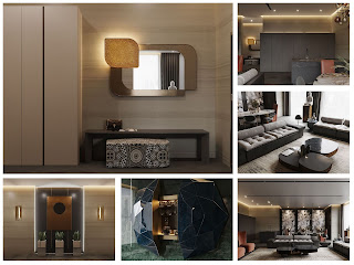
luxurious minimalism in the heart of Interior design
Today we are proud to present a new project commissioned by a client whose professional activity belongs to the field of
business brokerage. Meet:
luxurious minimalism in the LESH corporate style, embodied within the penthouse of the RED SIDE residential complex in the very heart of the capital,
The main wish of the customer was to create an exclusive interior that will harmoniously fit into the overall concept of the RED SIDE premium quarter, but at the same time will become an ideal place to relax and fully take a break from the hectic pace of life in the metropolis. It can be argued that the idea was a success thanks to non-standard solutions and the designer's creative approach.
The magic of tranquility through a lighting solution
The author of the
project was very attentive to the design of the entrance area, because it is she who forms the mood in the interior of the
entire apartment. Here, barely stepping over the threshold, you plunge into the magical atmosphere of peace and tranquility. Everything in the lobby is filled with soft warm light. The effect is achieved by a stylish pair of Terra by Reflex (these sconces look like they were lifted by the artist's hand from the night sky) and well-placed spotlights.
The corridor is partially separated from the living room by a wall with a rectangular niche, which is
successfully decorated with the Italian Frauflex and De Castelli panels. Three mirrored vases by Tonelli Design completes the composition. The
mirror in a
luxurious frame, stylized in aged bronze and
decorated with Sicis mosaics, is also equipped with LED lighting. By the way, the mosaic tiles of this Italian brand were also used by the author in the design of the private area.
Another eye-catcher in the lobby is the splendid glass console by Sicis, topped with a unique hand-crafted bowl by artist Regina Medeiros. An amazingly beautiful panel, made in the traditions of abstract art, serves as a worthy background.
Living room: zone of comfort and functionality
In this project, it was decided to abandon the clichés and abandon TV. It is curious that at first it was not easy for the client to part with the idea that a “black square” must be located opposite the sofa. But the designer managed to convince him that it was time to get rid of stereotypes. As a result, the TV was replaced by a luxurious bar from the luxury collection Diamante by Sicis, whose beauty is emphasized by a
magnificent background in the form of panels of antique green hue.
The successful filling of the living room with upholstered furniture from Baxter, the exquisite Chrysler coffee group from JMM, as well as other stylish and functional items of European furniture brands allowed us to get a comfortable modern territory for family vacations and pleasant parties with friends.
The dining table from the Lagos collection from Baxter on cylindrical legs of different sizes with a spectacular stone top deserves a special mention. The composition is complemented by a graceful accent above the dining room - a Fluxus lamp in the form of a thin frame in matte bronze, decorated with decorative glass spheres of
different diameters.
Kitchen area: non-standard and stylish
The complete absence of numerous cabinets and shelves hanging over your head in the cooking area is a design find aimed at creating a single
stylistic space with a rejection of boring standards.
The Maxima kitchen from Cesare fits perfectly into this interior. The functional solutions of this manufacturer open up wide horizons for design ideas, allowing you to go far beyond the boundaries of
traditional kitchens.Porcelain stoneware floor: an alternative to wood
Another design feature is the abandonment of the classic wood flooring in favor of a modern floor from Florim's Tesori large-format porcelain stoneware collection. Combined with the warm background of wall coverings from the Armani Casa fashion collection, Italian porcelain stoneware slabs look solid and unusual.


0 Comments